Introduction
This project was an analysis and reimagining of the Denver Zoo’s ticket purchasing user flow. The website is extremely outdated and inefficient, needing a minimum of 10 screens to complete a purchase. Additionally, the zoo’s website lacks identity, using inconsistent colors, fonts, spacing, and more. With the help of my instructor, I took on every stage of this project, from user testing to design and prototyping.
Over the course of a four month period I modernized the Denver Zoo ticket flow experience, eliminating the common pain-points. My goal was to make the website more efficient and better looking without losing any of the features that the zoo offers.
Research
I began my research by testing the current experience of the Denver Zoo website with five participants. This helped me identify the most common pain points and gave me an initial understanding of how to improve the current design. All of my users identified the inefficiencies of the website, with each getting exhausted by the sheer number of screens. Additionally, many complained about the design language (or lack thereof) of the website, stating that it felt outdated and ugly.
With the users’ opinions in mind, my research continued with competitive analysis. I compared the Denver Zoo’s features with three other local entertainment spaces: Meow Wolf, Cheyenne Mountain Zoo, and the Downtown Aquarium. What I found was that the Denver Zoo was actually feature-rich compared to the others. However, the way in which these features were implemented caused bloat, with most of them having their own screen. To cap off my research I wrote three “how might we” statements: how might we add one-click payments, how might we incentivize users to login, and how might we make cart editable without resetting progress.
Design
Zoo goers need a more efficient way of purchasing tickets online because the current website is far too bloated.
To start the design process, I made a user-flow diagram for the current experience. This highlighted the excess and gave me a better understanding of what could be cut from the website. With at least twenty different interactions, it was now more clear than ever that the zoo website needed a serious update. Additionally, this analysis highlighted that the majority of the ticket buying flow was after the user has already selected the number of tickets they need.
Next, I moved on to low fidelity wireframes of my ideal user flow. Trying to fit all the necessary features into as few as possible, I drew five screens initially. The flow went from the home page to the ticket quantity page. Next, the user would arrive at the cart summary, where they could choose to add accessories, checkout as a member, or checkout as a guest. Choosing to add accessories would naturally bring them to the accessory screen, which would then redirect them to the cart summary page. Upon clicking the “checkout as guest” button they would be directed to the payment information screen.
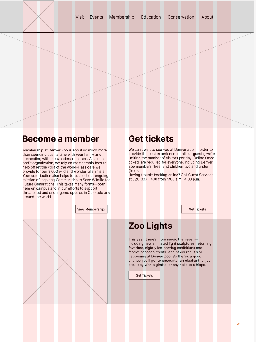
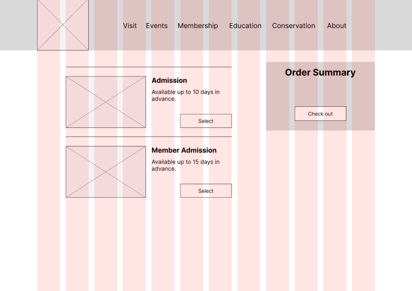
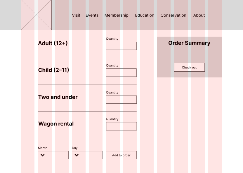
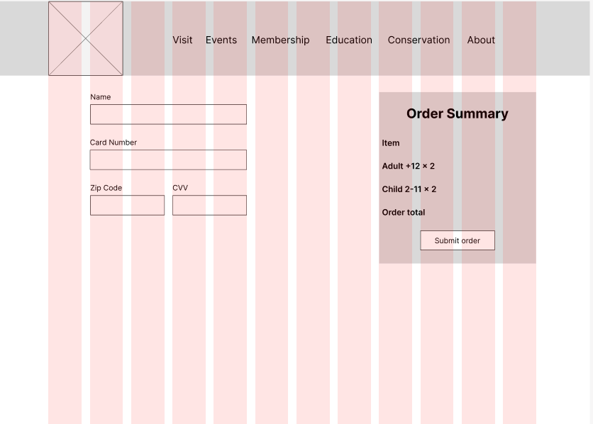
After completing my low fidelity wireframes, I began making mid fidelity versions in figma. These were not just digital copies, however. I made several changes to the layout of my prototype to make it use the space more efficiently. I added the wagon rental accessory to my ticket quantity page, made an “order summary” box to each of the screens aside from the home page, and I added real copy where it belonged. Additionally, I made components for ease of adding and modifying my prototypes in the future.
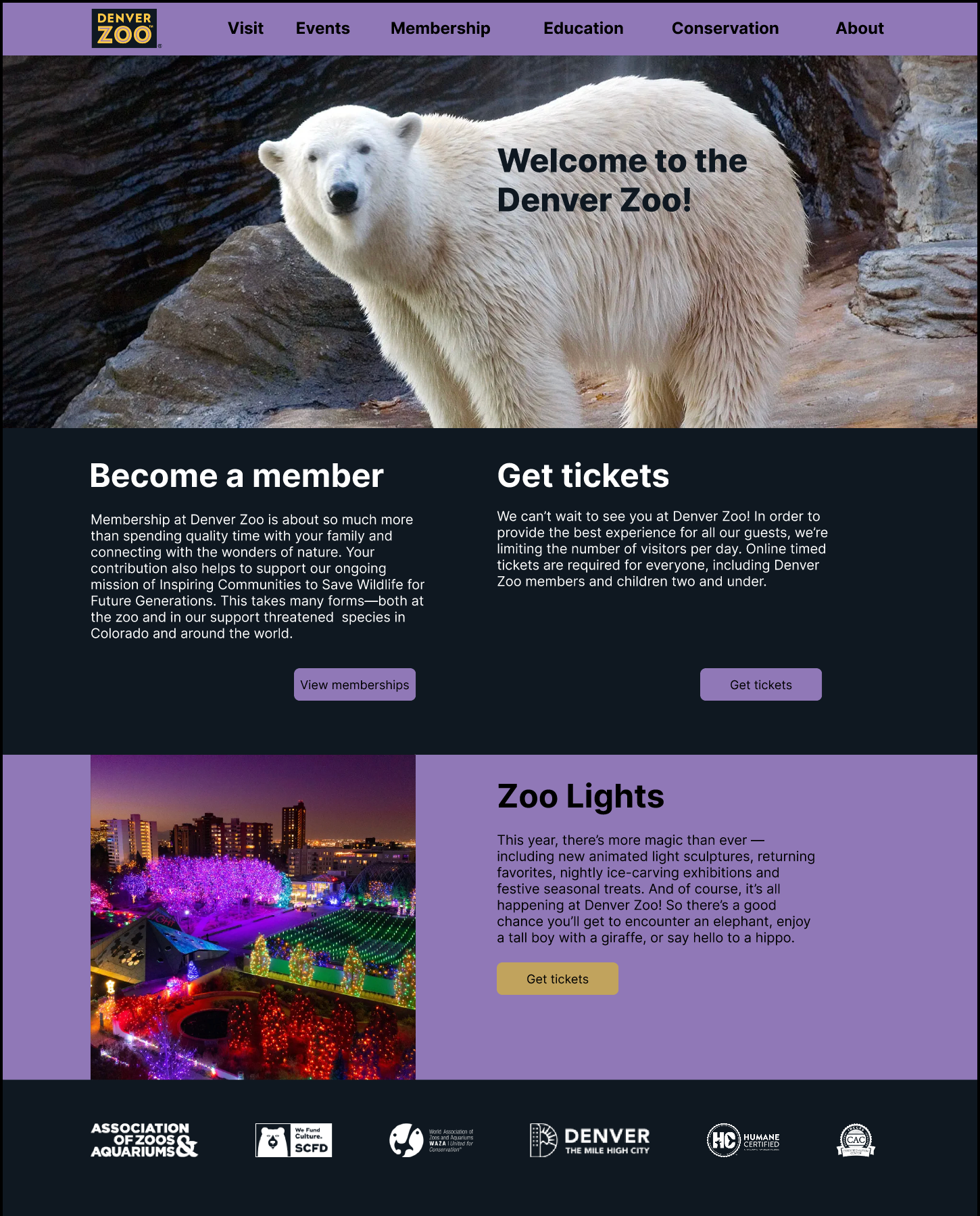
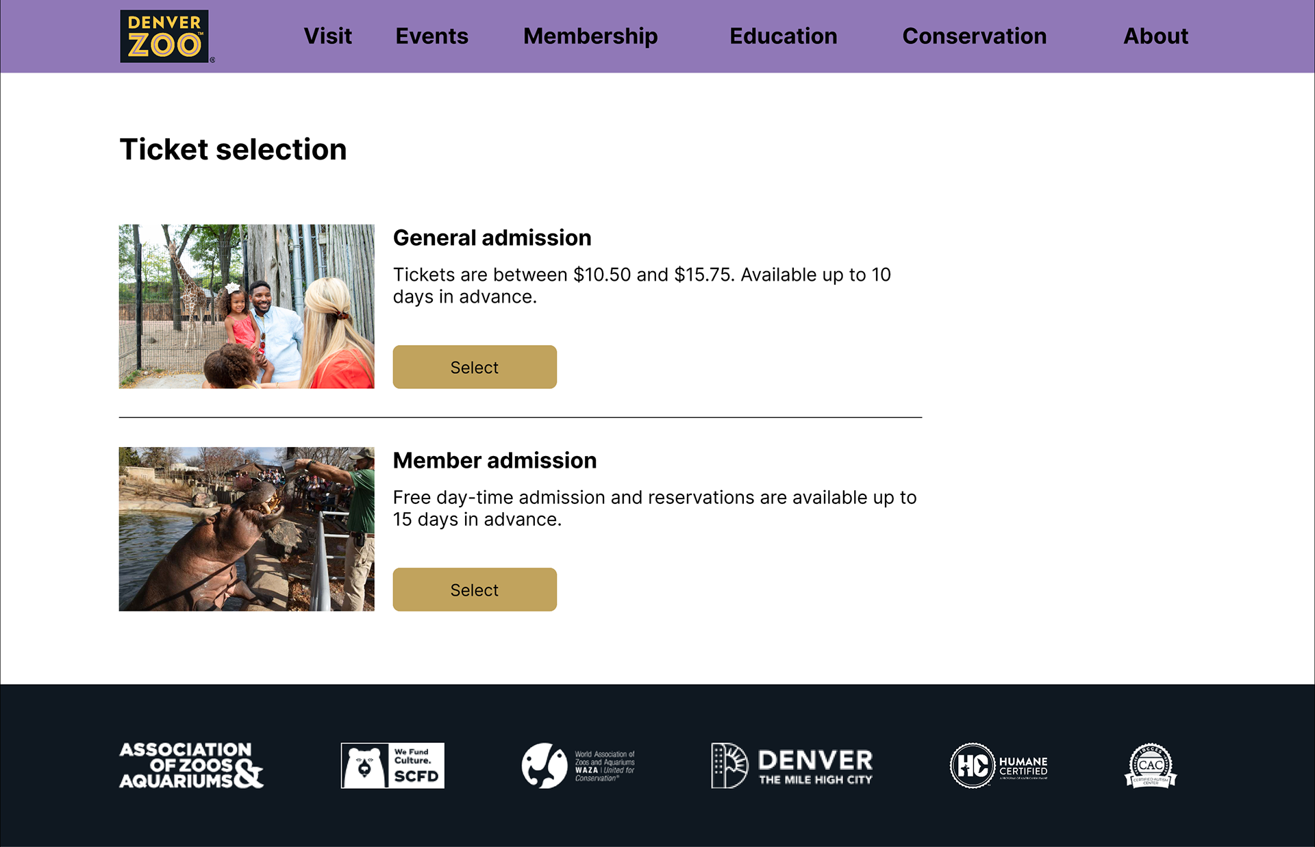
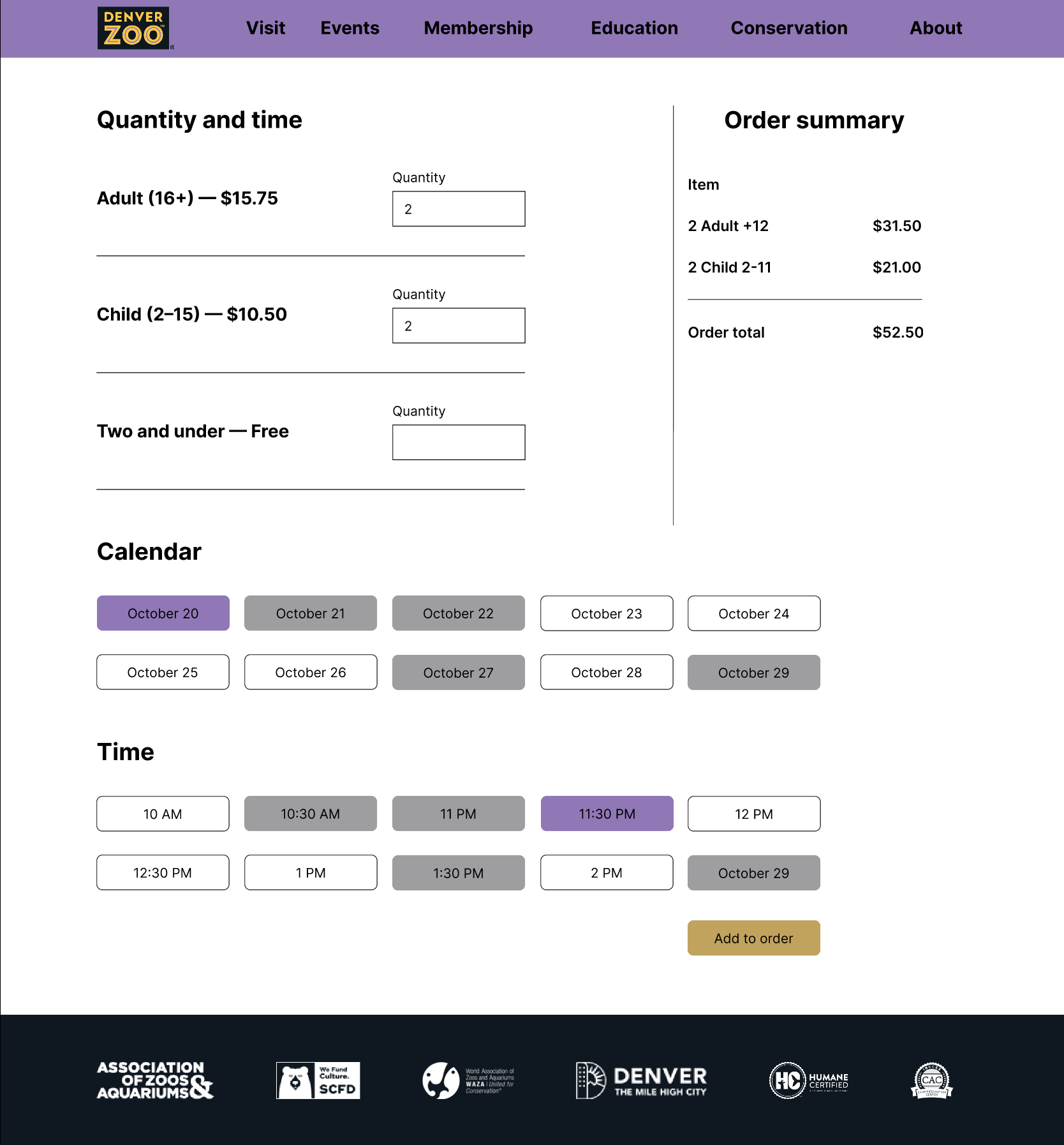
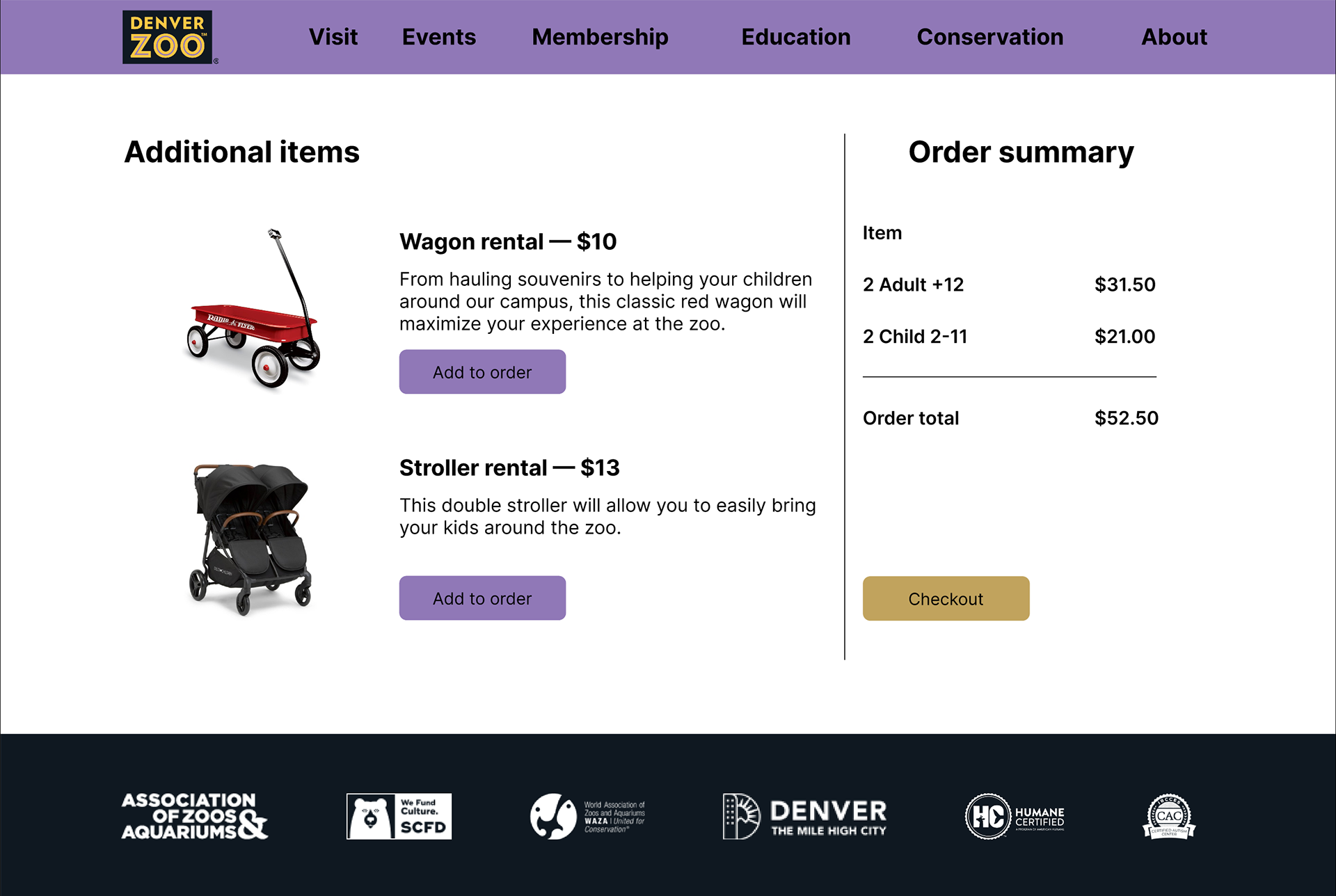
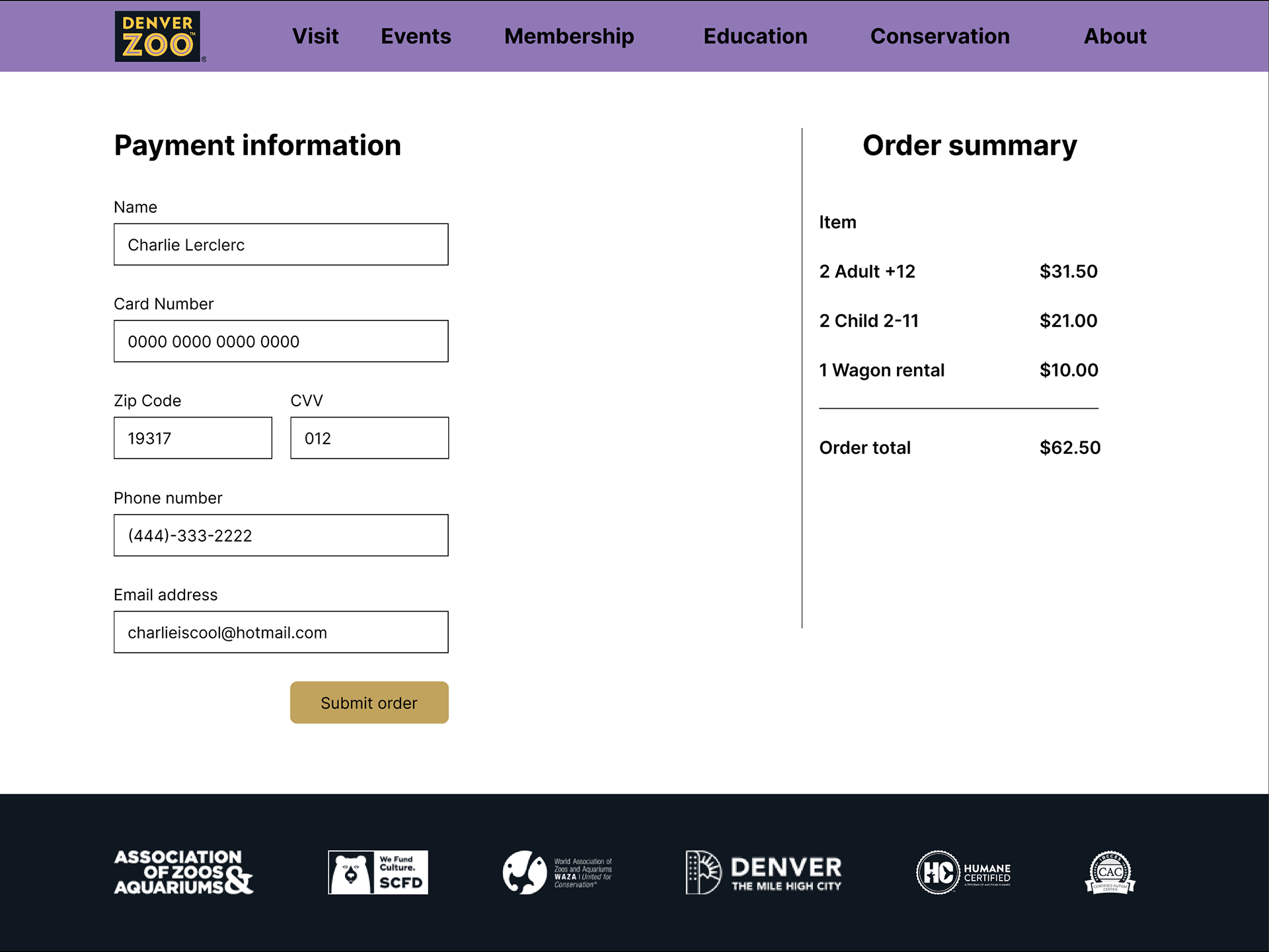
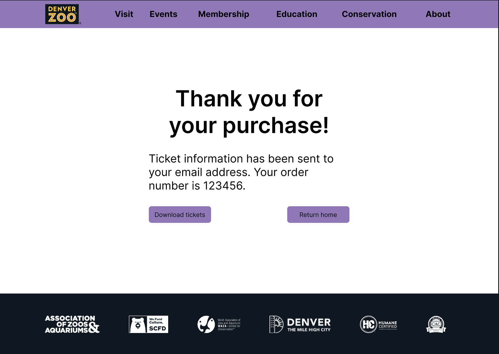
Finally, I moved on to making my high fidelity prototype, a process that was mostly updating my mid fidelity prototype to look like a finished product. For one, I established a color system, limiting myself to colors of the zoo’s logo as well as grayscale. I added imagery to enhance the user experience and make the website feel more enjoyable to be on. I also added an order confirmation page. Lastly, I updated the copy, as my initial version was poorly written and bloated. Here is a link to the prototype.
As I previously mentioned, I had instructor feedback throughout this process which helped me make my prototypes more robust. There were several things that I initially incorporated into my design which I had thought looked good, but the advice I received proved them to be foolish in one way or another. For example, I initially used drop-down menus to choose date and time, but I had not considered that this would make it unclear whether or not that specific slot was actually available or not. As such, I pivoted to having a small calendar with grayed out buttons to indicate unavailability. Another example is that I originally had a box around the order summary section, as I thought it would promote strong hierarchy. After being told to eliminate it, I saw that all it did was make the space feel more cluttered and that the alignment was enough hierarchy itself.
Evaluation and results
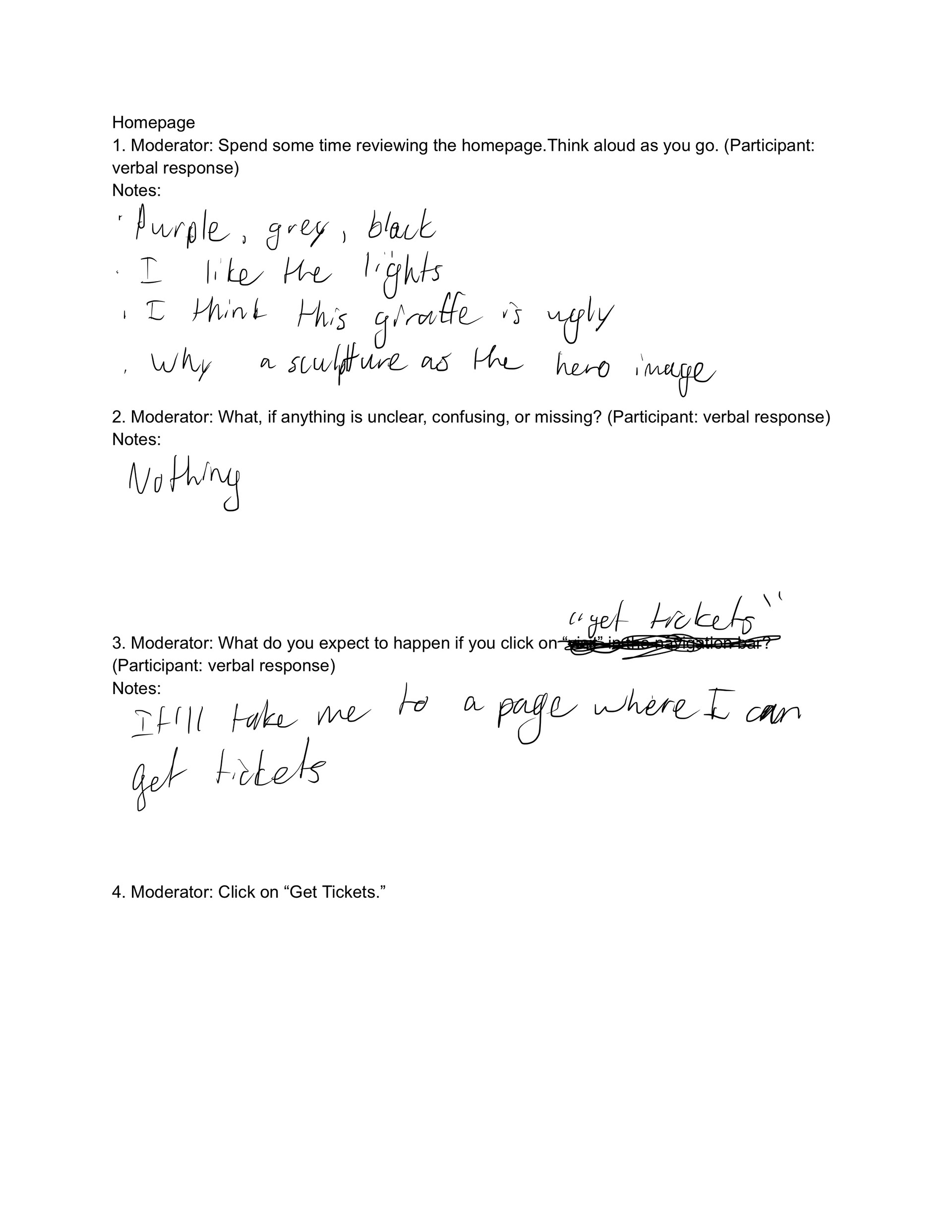
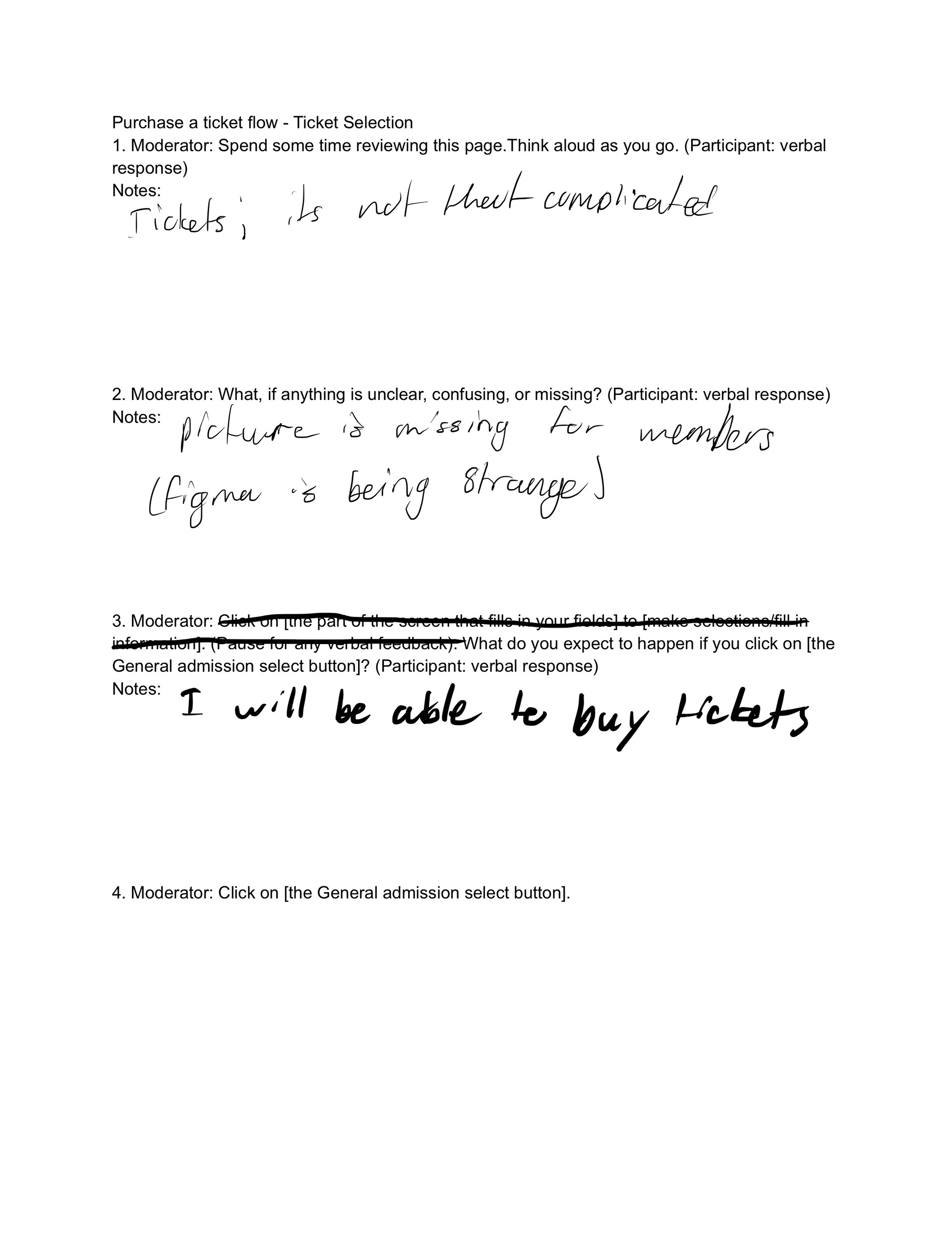
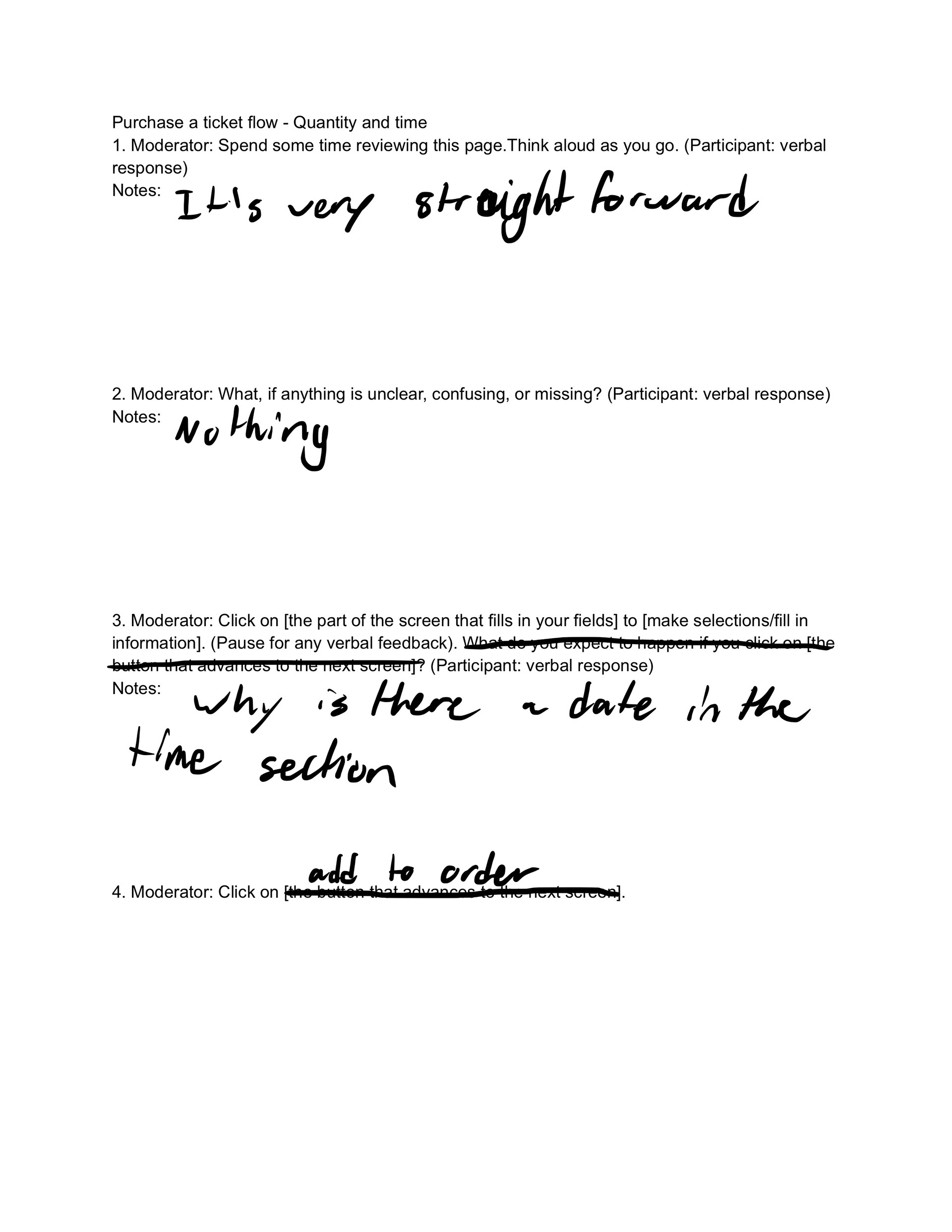
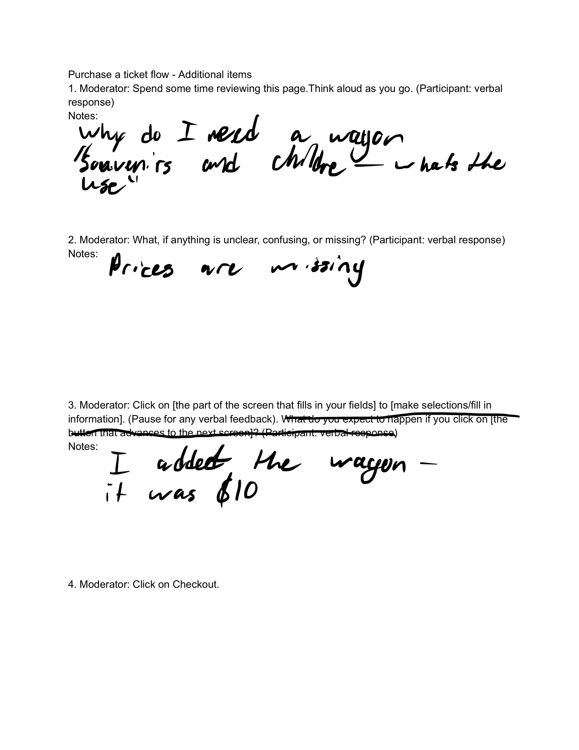
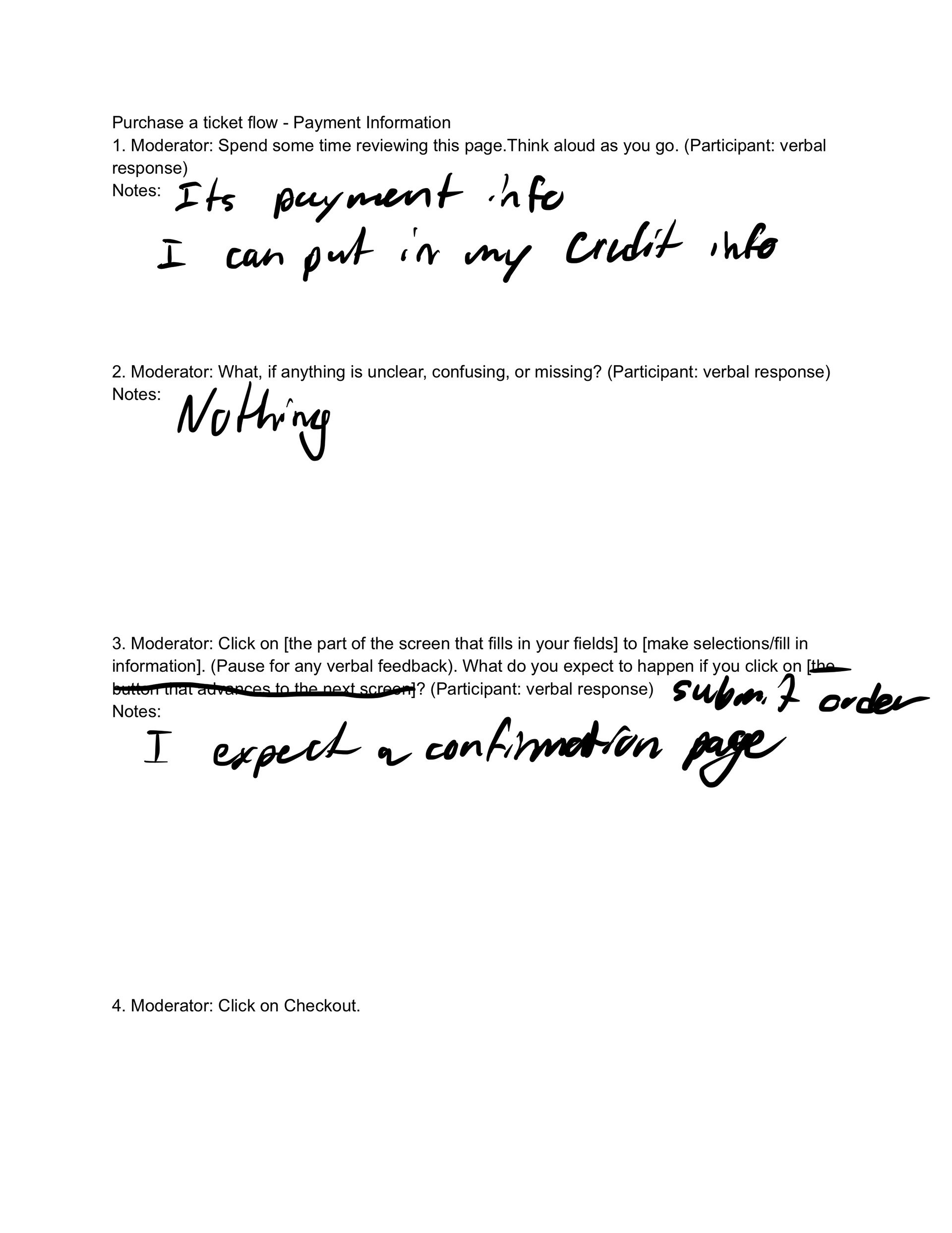
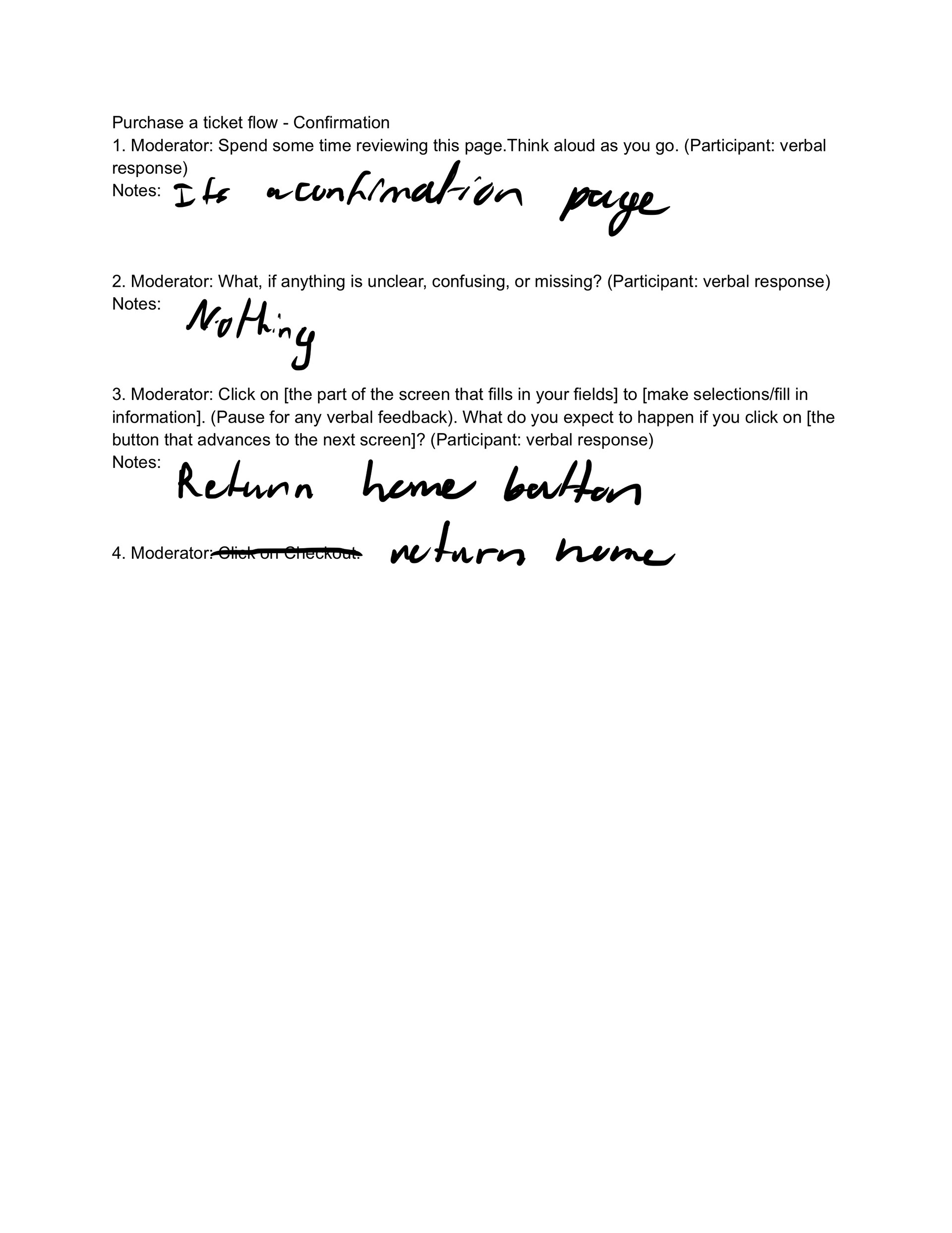
Once I completed my initial high fidelity prototype, I user-tested it using the same interview questions as I had done with the Denver Zoo’s current website. What I found was that my design was a significant improvement, but still had work to be done, especially aesthetically. For one, users felt that my navigation bar took up too much of the screen. One user pointed out a typo that I hadn’t noticed before. Additionally, I had not put prices on the accessory items. The alignment of the ticket types also bothered another user. Finally, I was missing a footer on most of the pages.
The nav-bar was the hardest of the issues to fix because the reason it was so large was to accommodate the Denver Zoo logo which is rather tall. To solve it, I first tried letting the logo stick out, but that just felt like an accident. Instead, I cropped it to just include the logotype, eliminating the large lion’s head. I added the footer to all of the pages for consistency, and reformatted the problematic items.
Reflection
There were a few things that I would like to change if given more time. For one, I never was able to incorporate a user flow for members and would like to see how efficient I could make it. Second, I would have liked to incorporate more information such as parking, events, hours, etc… into the home page. Finally I still think the layout design could use some work. While my prototype is very functional, it does not really stand out. I would like to look at some more unique e-commerce sites to see how I can make mine more memorable.
Overall I am pleased with my first real step into user experience design, and there are many things I have learned. Before this journey, I did not really appreciate just how much the quality of user feedback can make a difference. In both user testing phases, I found that there were a couple interviews that did not really provide much information at all. Additionally, this case study proved to me how much of a difference consistency makes. While I still think there are aesthetic improvements to be made, my prototype looks far more polished than the zoo’s actual website simply because I used rigid design guidelines while they did not. Lastly, as I was making my high fidelity prototype I found that I wanted more collaboration. Even though there were obvious flaws, I did not realize them specifically until I had another person look at my design and point out its flaws.
